Here’s Why You Should Be Using Pantone Colour Of The Year
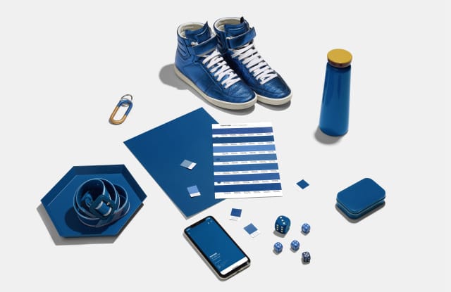
Pantone announces a new colour each year that sets trends for product development and purchasing choices in various industries, including fashion, interior design, branding and more. A team of analysts from Pantone conducts more than a year of global research into trends in diverse fields, such as tech, automotive manufacturing, beauty, art, and astronomy!
This year’s colour is Classic Blue, a familiar and reliable shade of blue that throws it back to the well, the classics. Psychologically, the classic blue brings a sense of peace and tranquility to the human spirit, according to Pantone. Want to evoke the same feelings that Classic Blue has for your branding and marketing? Here are the reasons why you should use Pantone 2020 Colour for your promotional products.
It makes your brand more trustworthy
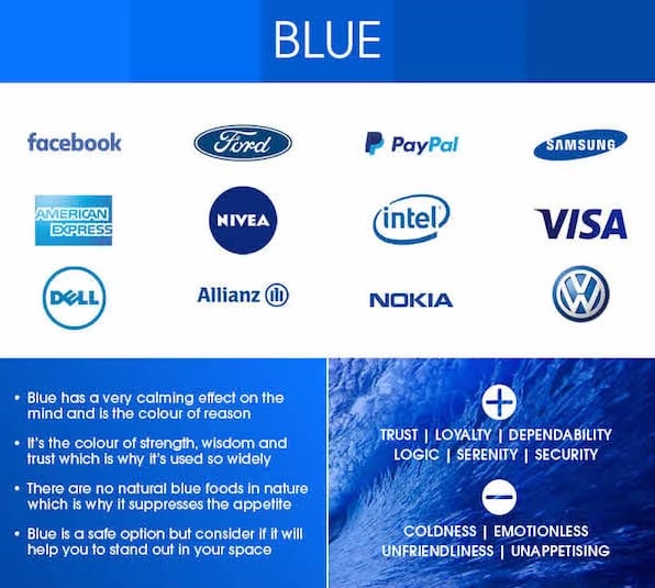
According to the color of psychology, blue suggests trust and stability to the viewers. Therefore, businesses that use blue in their branding are more likely to be portrayed as secure, trustworthy, reliable, and high-quality, according to CoSchedule’s Colour Psychology in Marketing Guide.
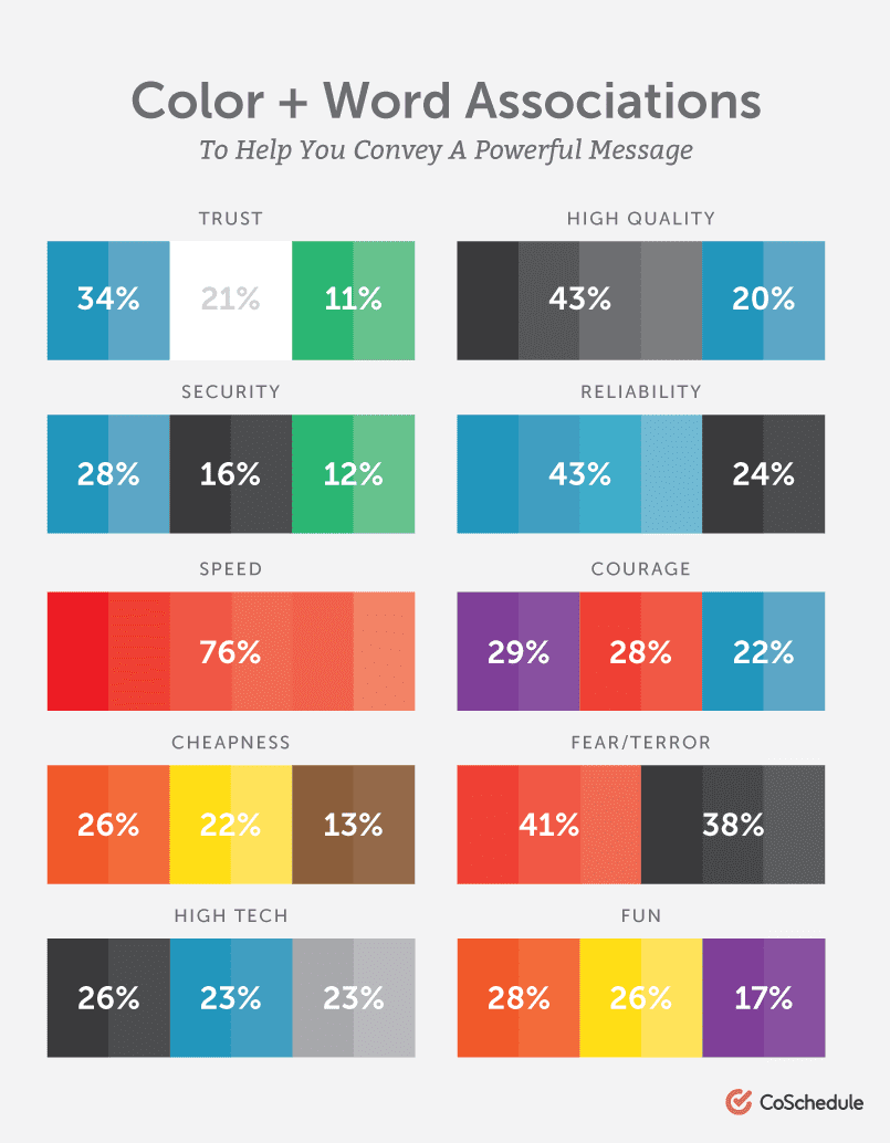
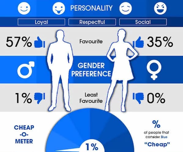
Blue is also more likely to target a mental reaction rather than a physical one, therefore improving call-to-actions and brand recall. Here are other statistics about the color psychology of blue from Hubspot.
It makes your promotional products on trend
Every time Pantone announces a new colour, it’s guaranteed to be on trend for the whole year. When you use Pantone 2020’s Classic Blue for your promotional products campaign, you are putting your company on the map as a trendy brand that keeps on top of the latest trends.
Nowadays, brands must constantly innovate to stand out. People no longer patronise old, reliable brands. People have a shorter attention span now so you need to always be on top of people’s minds by innovating and being on trend.
It’s a breath of fresh air for your marketing
Just because you have established brand identity doesn’t mean that you’re only supposed to stick to your brand colours. For seasonal campaigns, conferences, and events, you can shake things up by introducing Classic Blue into your promotional items and banners.
Updating your marketing colours can attract more consumers and view your brand in a new light. Invite new and old customers and clients rediscover your brand with a simple colour update.
It makes your branding stand out more
When combined with complementary colours, such as orange, Classic Blue helps branding and logos stand out more. If you want your light-coloured logo or messaging to be seen, use Classic Blue as a backdrop. You can also reverse it and use Classic Blue in your branding on a light-coloured background. For decoration options, you can check out our offerings here.
Promotional product recommendations in Classic Blue
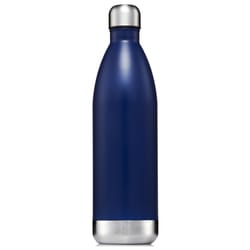
1. Hydro Soul 1 Litre Insulated Bottle

2. Redmill Brushed Cotton Cap
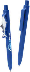
3. Eris Pen

4. Large Recycled Tuck Journal Book
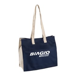
5. Printed Eco Organic Cotton Bag
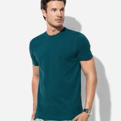
6. Men’s Organic Crew Neck
Make Pantone 2020’s Classic Blue work for your promotional products!
Update your promotional marketing strategy with the traditional Classic Blue. If you want product recommendations for your upcoming campaigns, book a call with one of our experienced Account Managers through this link. You can also contact us by phone or email.


